century next
Product & Brand DESIGN
MY ROLE
- Product Design
- Graphic Design
- Competitive research, prototyping, UI design
ADDITIONAL COMMENTS
- Green colour scheme, specific business field oriented
- Modern, unique design
MAIN CHALLENGES / TASKS
- Create simple, easy to use UI
- Information oriented
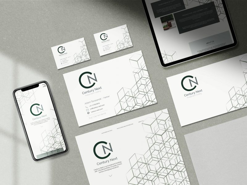
- Business card of the company
BRAND
- Start-up oriented company
- Investment Holding
- Young company
brand design
BRAND
Century next is an investment holding company, which has focus right now on emerging market of legal cannabis, the fastest growing consumer market in the USA. They have focus on early stage companies. Moreover, CN has partnered with some leading wellness and health & beauty brands to assist them in business development and product distribution in China.
Try the new Latte
Research
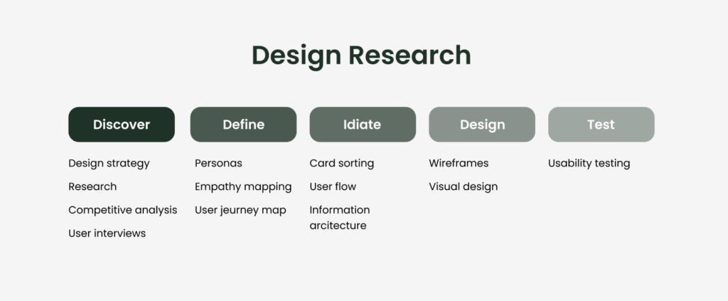
Design Thinking strategy
Competitive Research
Focus: Investment funds (eg. smrk.vc, smrk.vc)
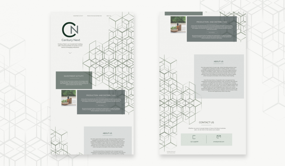
Every investment fund has different market focus and investment strategies. However, in terms of design, every investment want to look professional and trustworthy.I took simplicity inspiration from smrk.vc competitor and layout with animation ideas from smrk.vc . During research I have learned that Unfortunately, Century Next rejected to add images of team or their workspace in order to keep privacy.
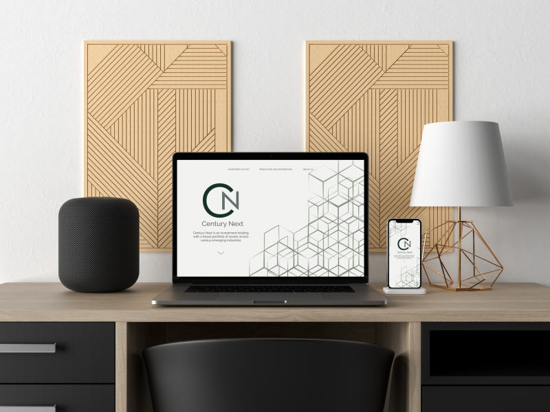
Company has requested simple, informative website, which would deliver their story and strategy. With limited visuals and focus on text, clients expected similar design to pitch or presentation slides.
Background graphic was created specifically for CN, which was a base for their visual branding. The idea of connection and relationship symbolise their personal approach to every client.
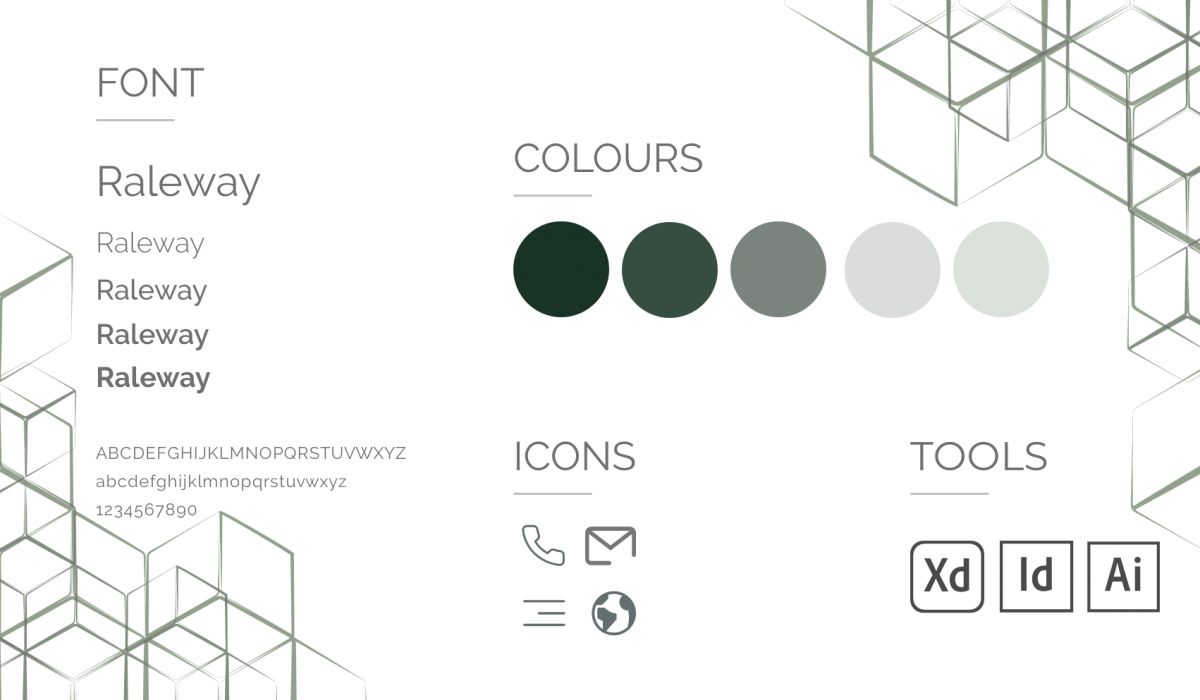
Green colour scheme has been requested from the beginning in order to focus on CBD business field. Psychologically is symbolises nature and associated with health and safety.
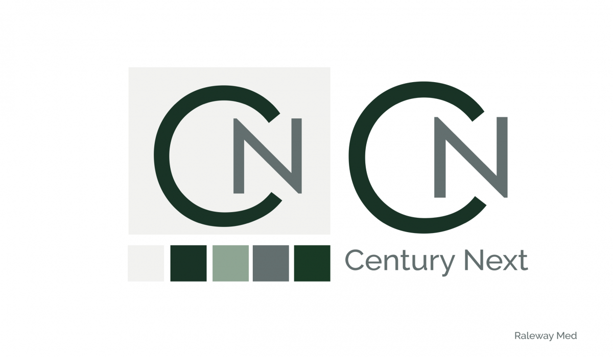
Logo was developed in Illustrator. Client has requested something bold, simple, but with the connection feeling. Since company is young, alongside with abbreviation CN full name was crucial.
CONTACTS
-
Churchyard Row 9
SE11
London - savikina.v@gmail.com
SOCIAL NETWORK
VERONIKA SAVIKINA
Digital Design | Layout Design | Graphic Design
